Colour Blind Friendly Mode
Just noticed a pretty neat approach on Trello to helping users who are colour blind: patterns.
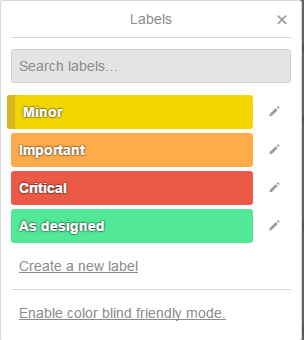
Labels go from solid colours:

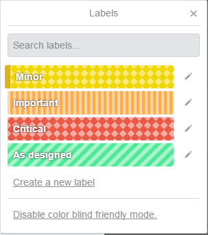
To nicely patterned (albeit slightly dizzying) blocks suitable for all:

Pretty straightforward to implement via pure CSS and a single class on the body, and hopefully an effective solution.
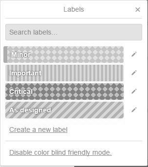
A quick check on the Coblis colour-blind simulator looks pretty good. This is simulated Monochromacy/Achromatopsia:

Having said that, I would love to hear from users that it actually works for them!