Raised panels the slightly harder way
Have you ever wanted to introduce a bit of material design into a 'flat' web app?
I did, and here's how I did it with a bit of CSS. We're aiming to end up with a vertical list of items (a la Google Inbox), where some of the items are raised with respect to other items.
A promising start
With just a couple of CSS rules, we can get fairly close to what we're looking for:
.row.nested {
    box-shadow: 4px 0 15px 0 #EAEAEA;
    border-bottom: 3px #ECECEC solid;
}
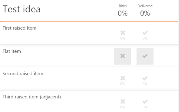
But there's a problem! Notice the extra shadows between the second and third raised items:

Particularly when the shadow is less subtle, the human eye spots unreal effects like these straight away. We only want shadows to fall on flat items, not on other raised items.
Enter z-index, stage left.
The problem we're trying to solve here is to place the shadow underneath raised items, but above flat items.
In order to do this, we need to separate the shadow from the element itself using ::before or ::after selectors. These selectors create a new element in the DOM relative to the currently-selected one, and allow us to add styles. Give this extra element a z-index, and we're in business. Michał Dudak describes the technique really nicely.
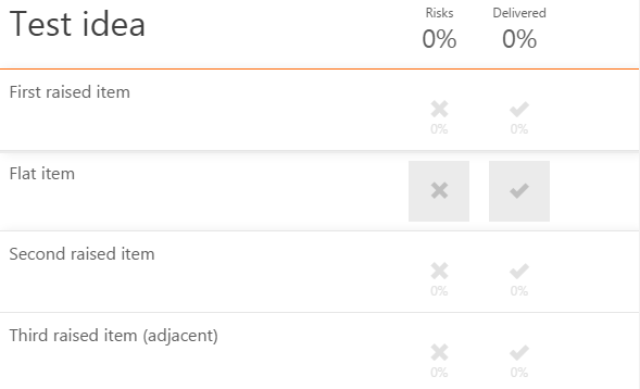
Here's the final result, along with the rough CSS:

.row.nested {
    position: relative; // For placing shadows
    background-color: white; // Needed to hide overlapping shadows
}

.row:before {
    content: "";
    position: absolute;
    top: 0;
    bottom: 0;
    left: 0;
    right: 0;
    box-shadow: 4px 0 15px 0 #EAEAEA;
    border-bottom: 3px #ECECEC solid;
    margin-bottom: -3px;
    z-index: -1;
}
With newer CSS frameworks like Materialize now available, material design should be more and more straightforward to implement.